Believe it or not, event marketers are on the same wavelengths as neuroscientists. Have you ever noticed how some event spaces are especially relaxing and calming, while others tend to irritate or perk you up? There’s a good chance the colour arrangements in those environments are playing a big part. Interior designers have long known of the influence of colour on our emotions and state of mind—the same holds true when appealing to the senses of event attendees.
When we create a unique brand experience, we aim to produce customized experiences that deliver unique messages and tell stories. The more vivid and authentic an experience is, the more effective and memorable the outcome for event attendees. Leveraging the scientific correlation between colour and emotion can help us engage our audiences in new ways and boost the impact of our brand experiences.
Designing with the outcome in mind
When harnessing this neuroscience knowledge, it’s important to incorporate it into your event design after thinking through the kind of reactions you want your audience to have. How do you want them to feel? What do you want them to focus on? Designing your event experience with the end in mind is an important component of design thinking, which helps to ensure that every event you create is more effective, and implementing these psychological effects is just a part of that smart approach to design.
When you know what emotions you want to evoke, it’s time to find just the right colour to fit the mood. A recent study by the University of British Columbia discovered that red boosts our attention to detail and performance on tasks such as memory retrieval, while blue enhances our ability to think creatively and encourages our ability to think outside the box.
Event design techniques you can try
Applying the psychology of colour theory to the environment of event design takes things up a notch and helps to ensure that you’ll get the response you’re looking for from your audience.
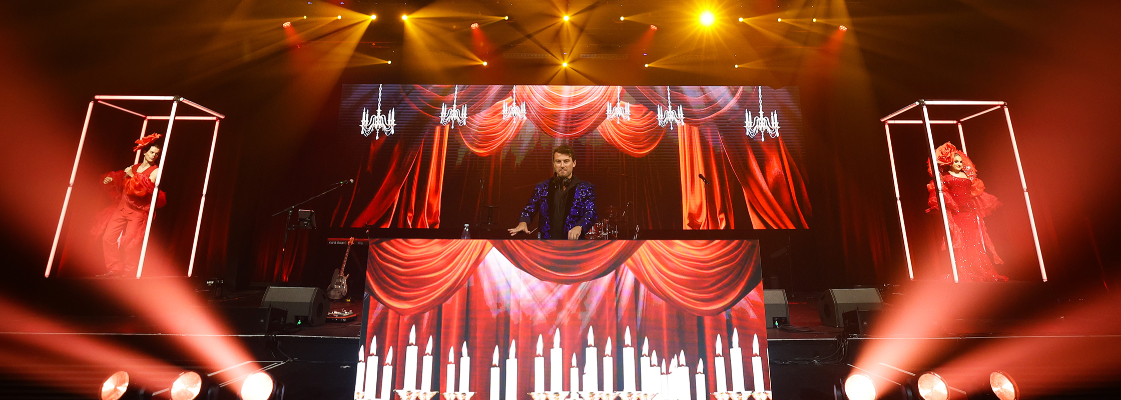
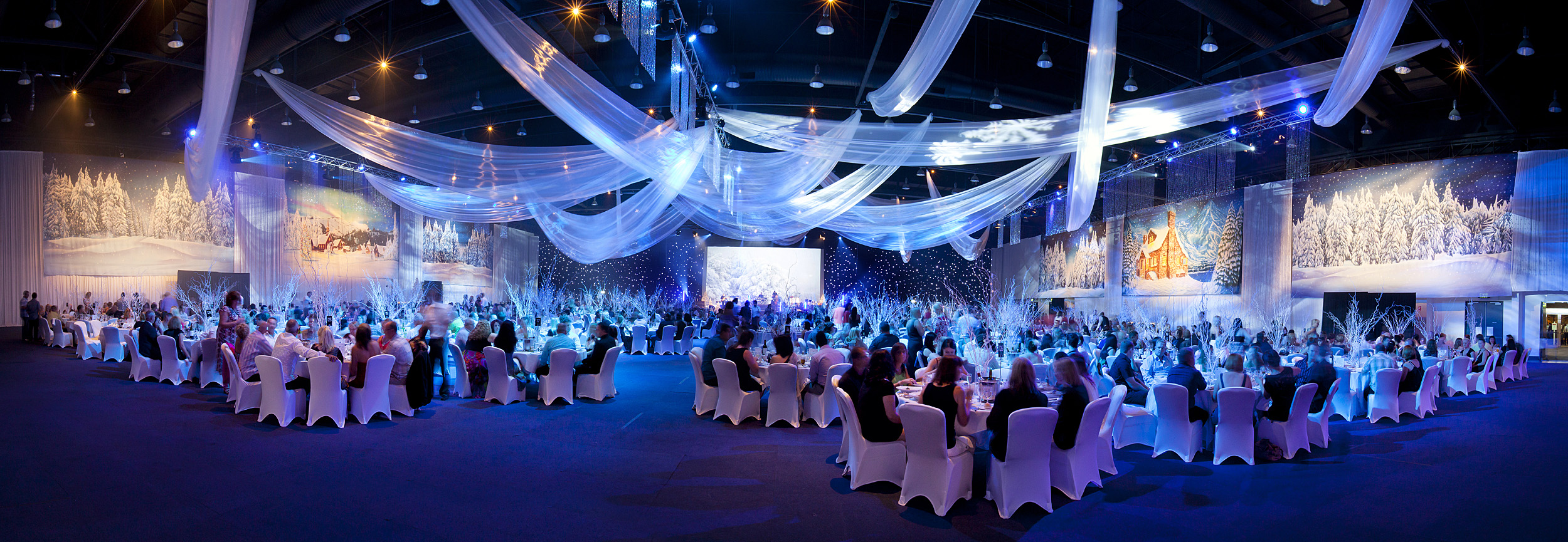
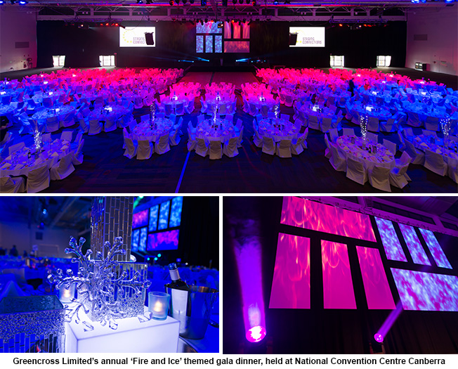
As an example, last year Staging Connections delivered Greencross Limited’s annual gala dinner with a “fire and ice” theme to inspire creative stimulation among participants through the use of red and blue. We designed a modular stage set using their range of digital banners and projection mapped various themed content to match each colour concept – sizzling flames for ‘fire’ and’ frosty blue colour bursts for ‘ice’. Even the table centrepiece styling was specifically designed to reflect one of the two concepts.
It’s important to consider what you ultimately want to achieve or evoke from the event to help you determine which colour palette is going to best help you achieve your goals. This guide from Sommer+Sommer, a UK advertising agency that specializes in brain training and neuromarketing, is a good starting primer on what emotions can be tied to colour. Exploring different ways you can utilize colour to engage your audience in a scientific way is a small addition to your design plan that could reap big benefits post-event. Think about your next event design—what colour can you connect with your theme and the way you want your audience to feel?
Related Articles
- Creating an immersive conference to engage your audience
- Transform your corporate event with creative stage design
- Keep your audience engaged and entertained with Event Poll
This post was originally written by Tony Allen, Director of Business Development, Freeman
Comments